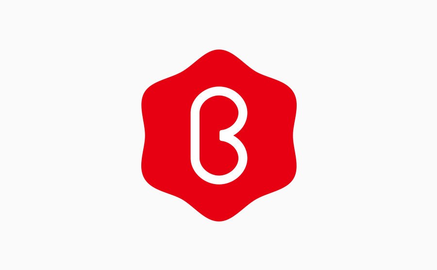
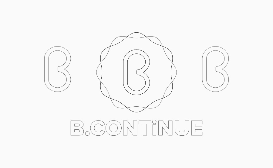
A central company logo representing hope, energy, and the network of six companies and organizations in Fukuoka.

- Client
- B.Continue Co., Ltd.
- Year
- 2015
A logo mark representing hope, energy, and the network of a group.
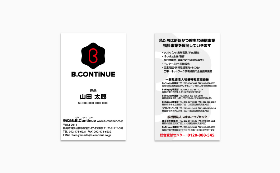
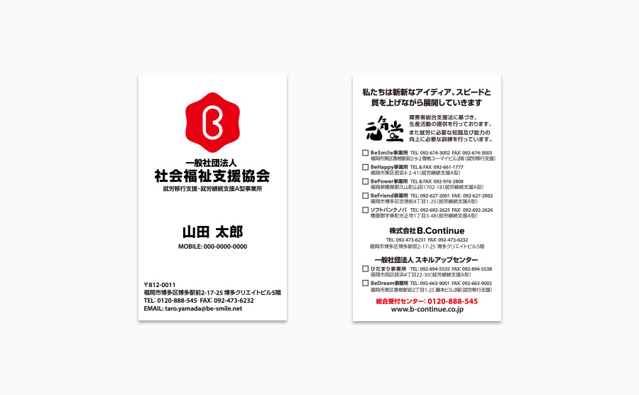
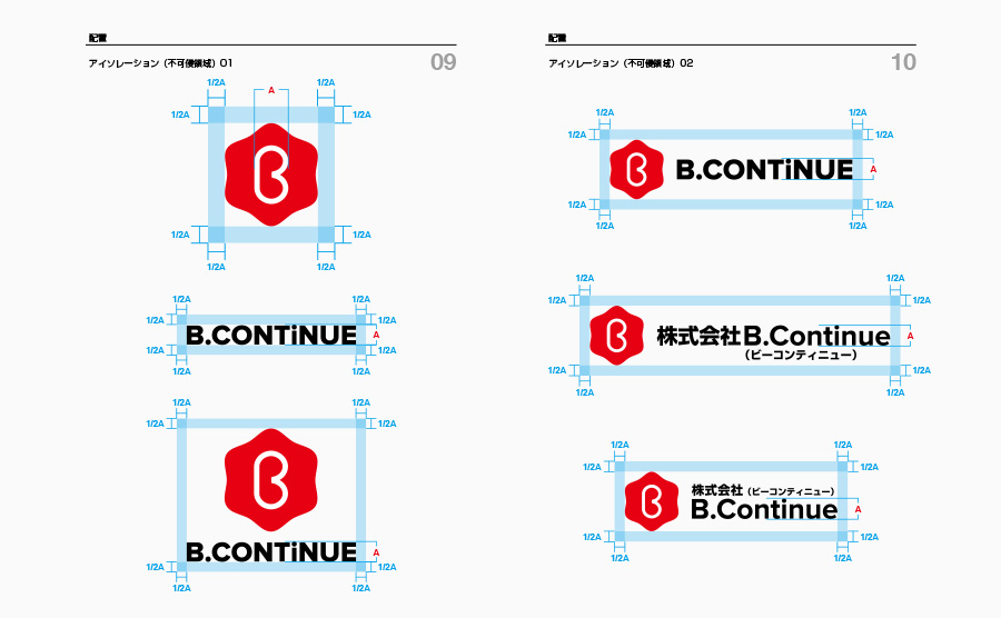
We have designed the logo mark, wordmark, and business card for B.Continue Co., Ltd. B.Continue serves as a central entity, including six companies and a general incorporated association within Fukuoka Prefecture, and it is the foundation of the group. The company is engaged in a wide range of businesses, including welfare-related services, cafeteria operation, frozen food manufacturing, electrical facility construction, seafood processing plants, and school operation. The logo mark we created is based on the letter "B" from the company name, B.Continue, and features a hexagon (hexagonal shape). It symbolizes the hope and energy radiating in various directions from the center of the "B" and represents the network of the group centered around the "B". Additionally, we have developed two versions of the wordmark: one with only uppercase letters and another combining uppercase and lowercase letters. The wordmark complements the logo mark, emphasizes the company's involvement in welfare, and adopts a visually clear and easily recognizable typeface from the perspective of universal design. Furthermore, we have utilized the inverse combination of black and red from the logo mark for the logos of the affiliated general incorporated associations, "Social Welfare Support Association" and "Skill Up Center," as well as for B.Advance Co., Ltd. This consistency in the branding across the group strengthens the overall brand identity.



Credits
- Project Management Art Direction Logo Design Business Card Design Branding
- Shozo Karato, AEDI Inc.

