Nakagawa Kitchen Logos
- Client
- Nakagawa Kitchen
- Year
- 2021
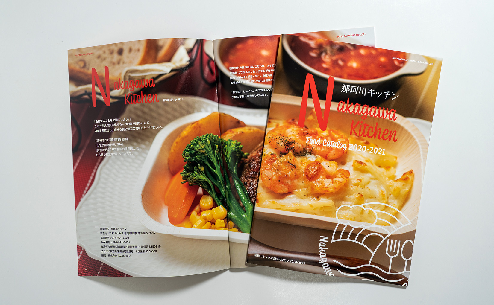
A logo mark expressing the brand world of a frozen food and prepared meal manufacturer based in Nakagawa, Fukuoka.
We designed the entire logo set for Nakagawa Kitchen, including the logo mark, wordmark, and type design. Nakagawa Kitchen is a frozen food and prepared meal manufacturer based in Nakagawa, Fukuoka. They specialize in using domestically sourced ingredients, avoiding chemical additives, and offering handmade prepared dishes. The logo mark we developed for Nakagawa Kitchen incorporates elements like the sun, mountains, river (representing the Nakagawa River), and utensils, creatively resembling trees. This design captures the essence of Nakagawa Kitchen's natural and abundant environment, aligning with their philosophy of "Harmony with Nature – Environmental Conservation, Healthy Living, Blessings of the Earth." We've also created several wordmark/type variations, combining Japanese and English text, including a focus on their "Nakagawa Kitchen Premium Organic Series." These logos aim to enhance Nakagawa Kitchen's brand awareness among a wider audience, encouraging repeat purchases and gaining more fans. Our goal was to create a brand that resonates with people, encouraging them to explore Nakagawa Kitchen's products, dishes, and cuisine and ultimately become loyal supporters of their ethos.
Credits
- Art Direction Logo Design Label Design Branding
- Shozo Karato, AEDI Inc.