LogoLand Sans: An Original Typeface by LogoLand
- Client
- AEDI Inc.
- Year
- 2026
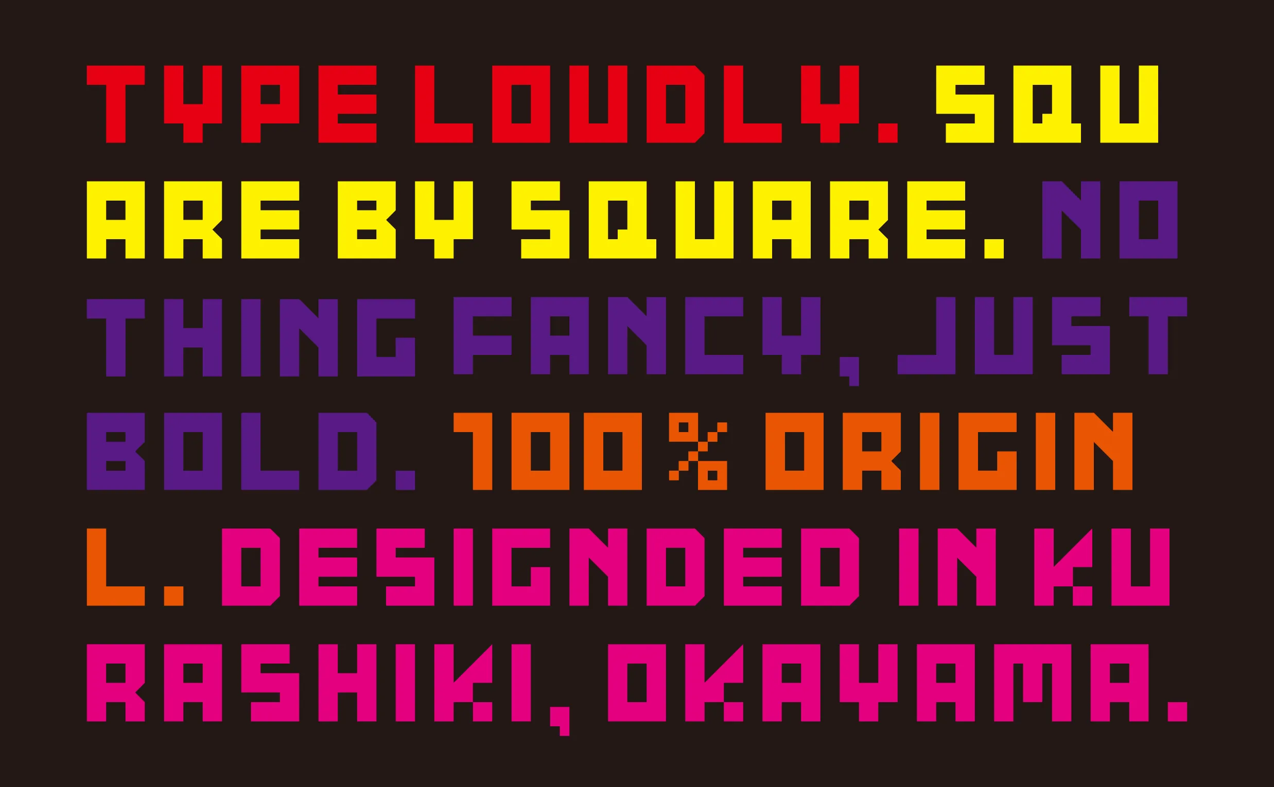
Block by block. A cute and quirky typeface born from the logo of a logo design shop.
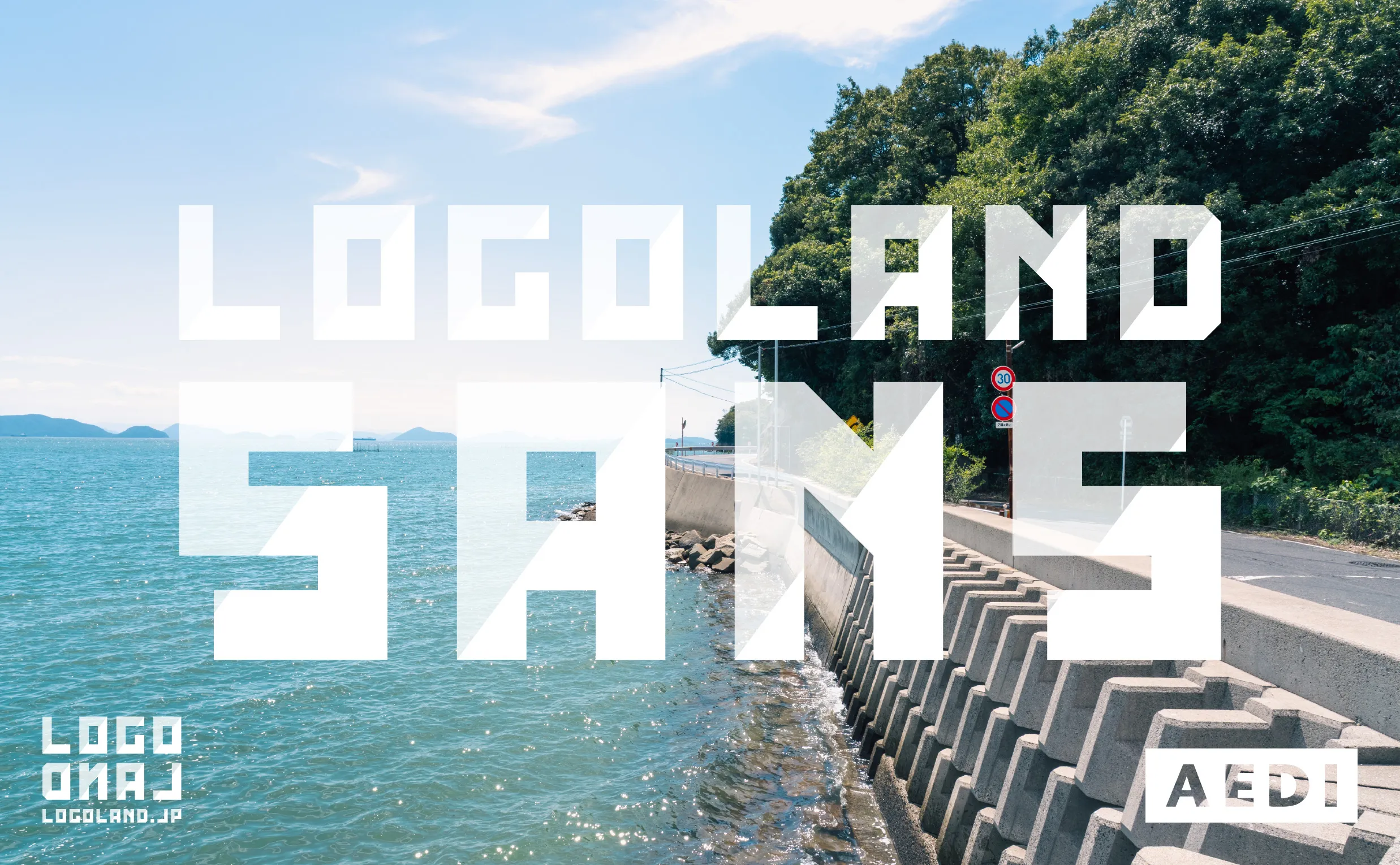
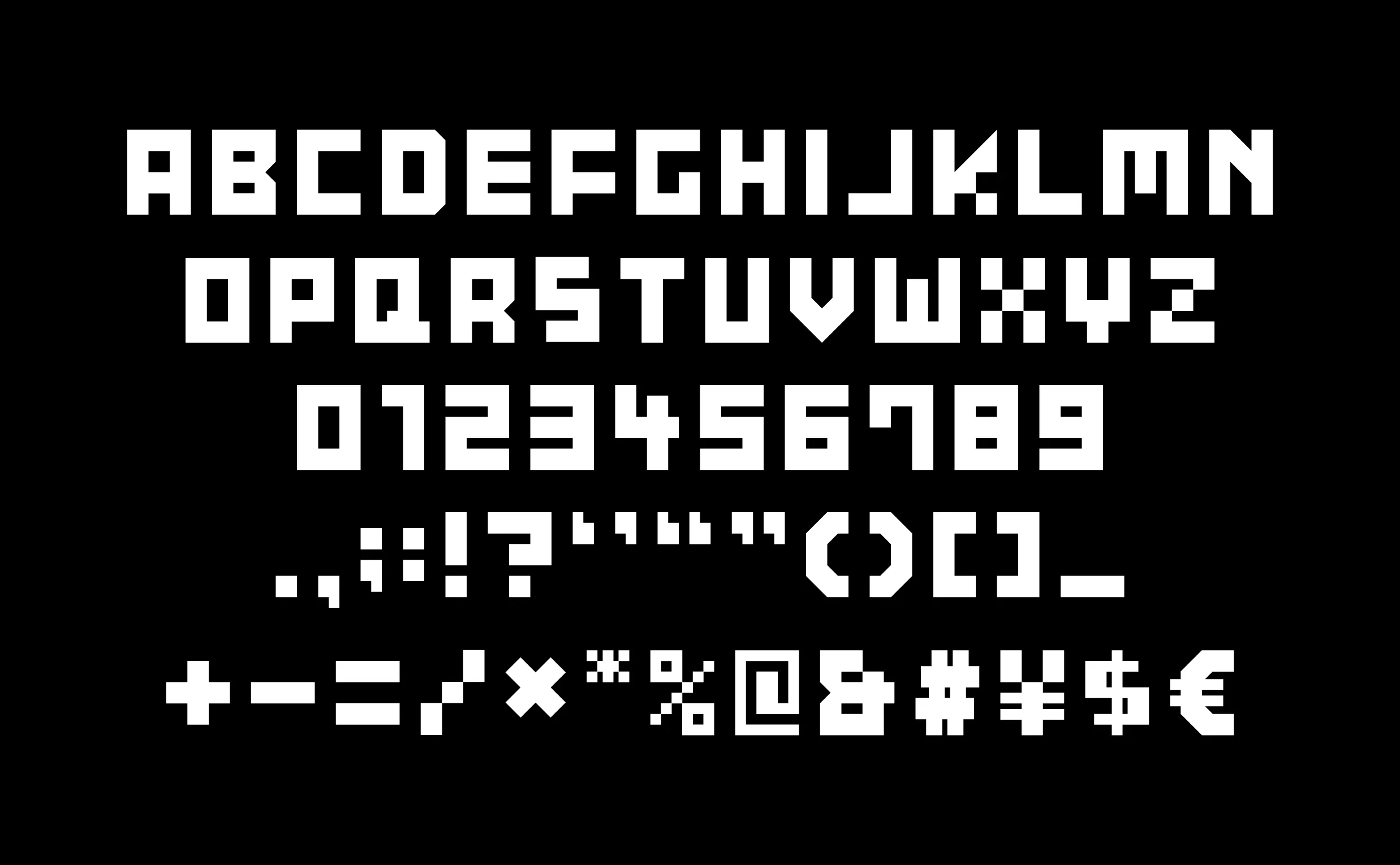
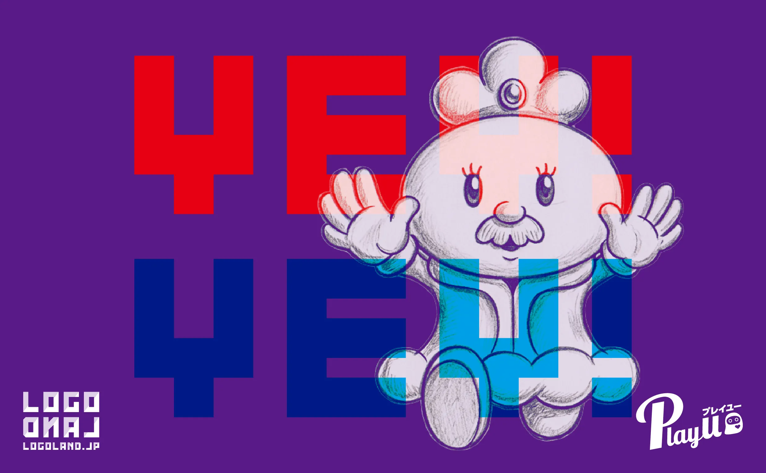
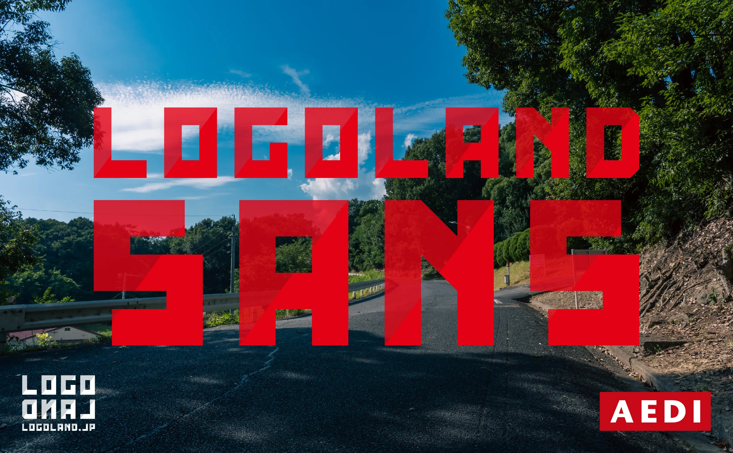
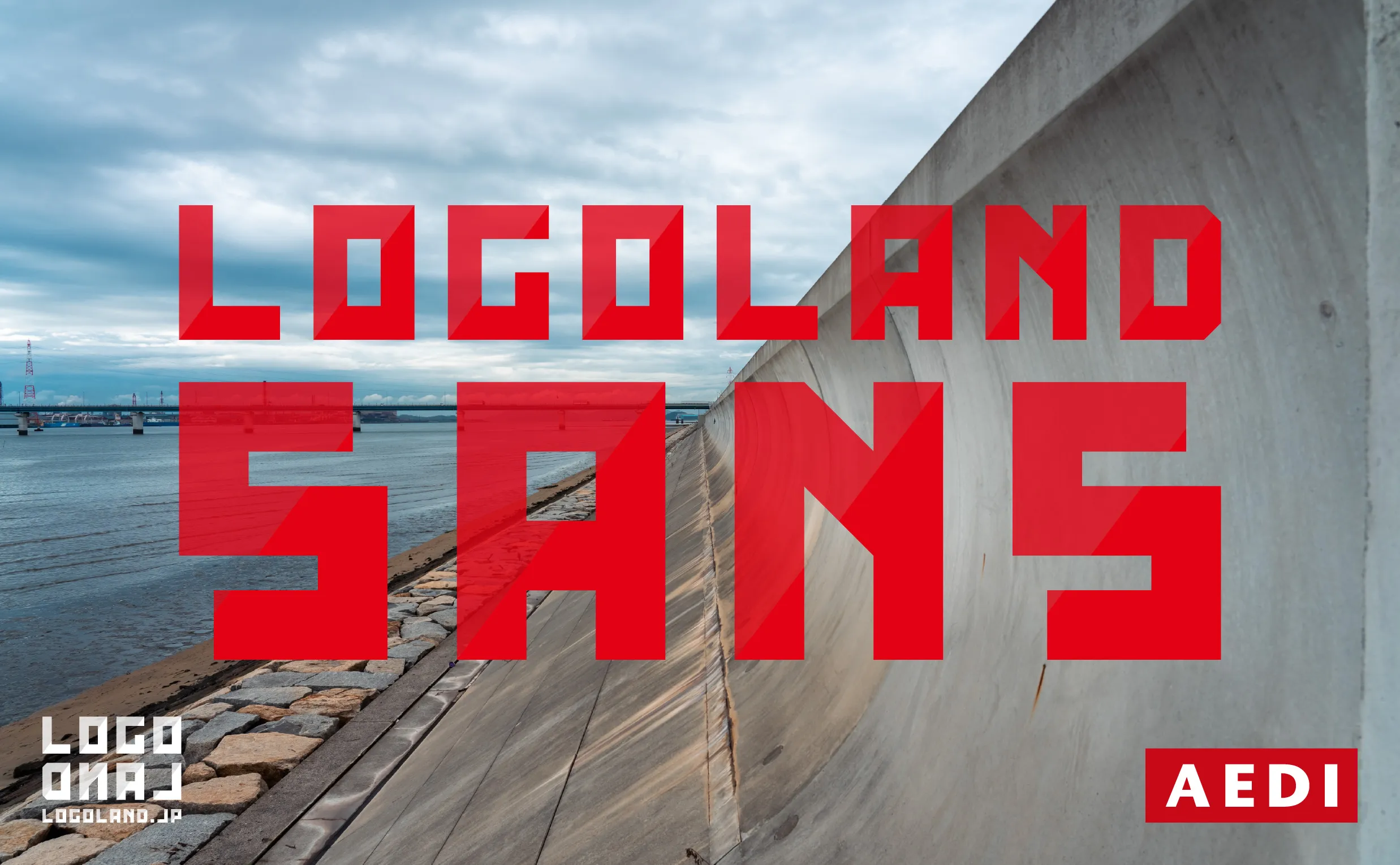
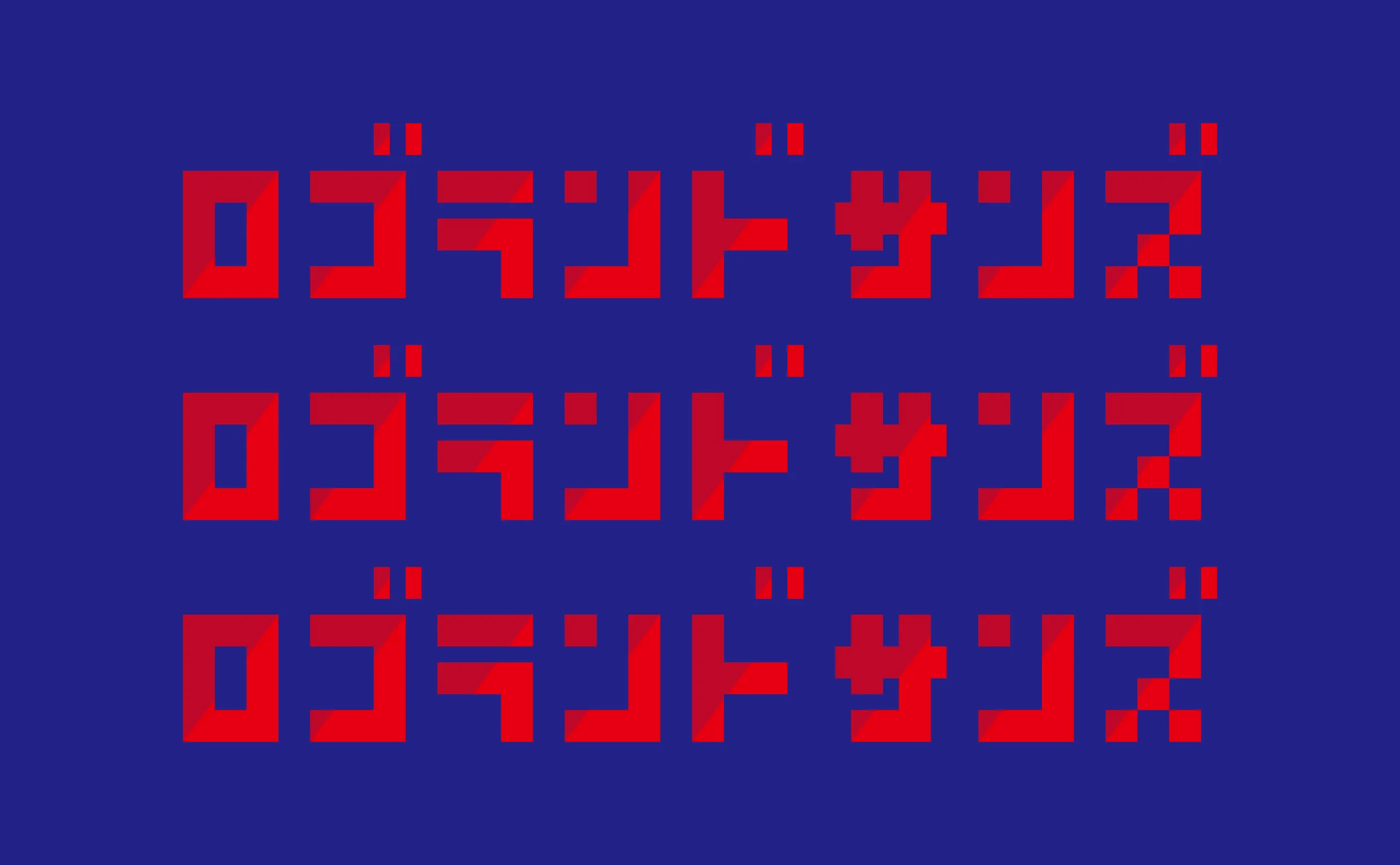
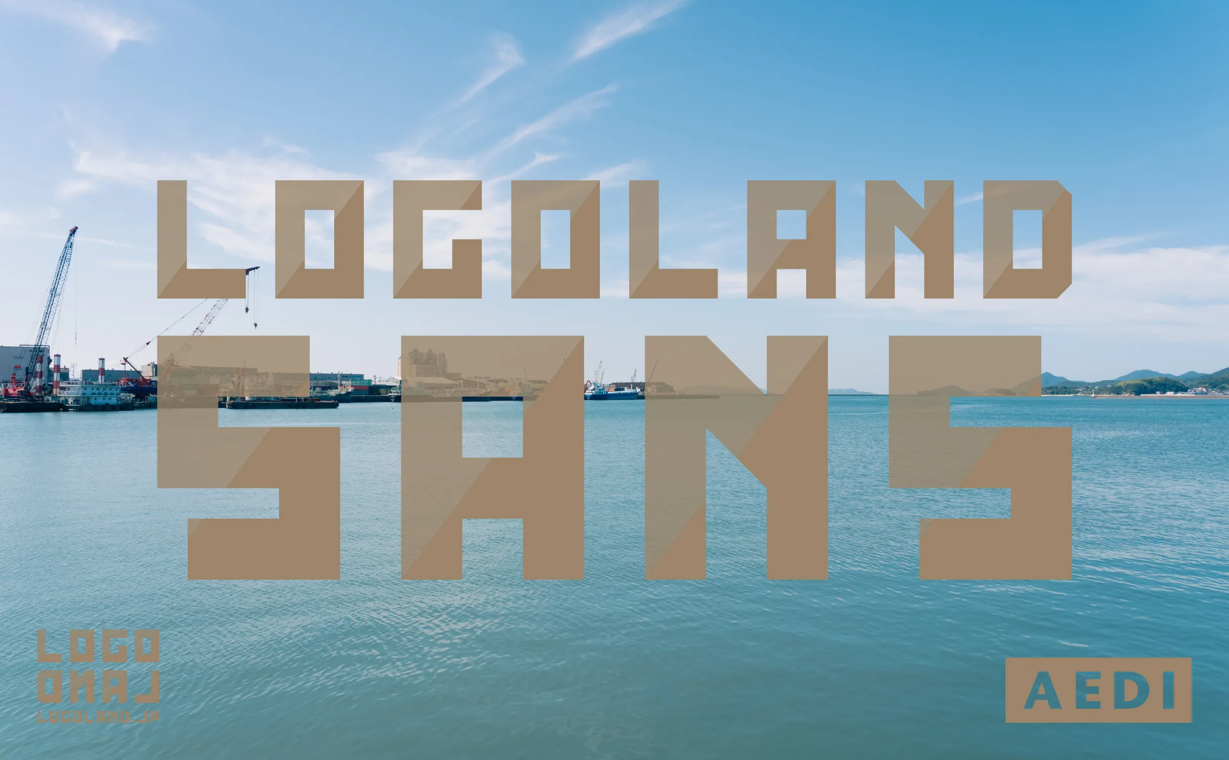
LogoLand Sans was originally designed for the logo (logotype/wordmark) of LogoLand, a small logo design shop, and was later expanded into a full typeface as part of the brand's service development. When designing the LogoLand logo, we envisioned a typeface that was solid and cool. However, once we finished designing the uppercase letters A to Z, numbers 0 to 9, and symbols, we found the result looked solid, but rather than cool, it somehow came across as cute and quirky. Perhaps it's the blocky, angular look, as if each letter were built from small square tiles. For the key visuals of LogoLand Sans, we photographed scenes around Kurashiki, Okayama, where AEDI is based, this summer, with the exception of the photograph of the Onomichi Channel used in LogoLand's key visual. As a little playful touch, we also invited "O-chama," a character from PlayU, an AEDI sub-brand, to make an appearance. LogoLand Sans is primarily intended for use by LogoLand, but we also plan to use it in various AEDI projects and other creative work in the future.

Credits
- Planning Art Direction Typeface Design Branding Logo Design Typography Photography Character Design
- Shozo Karato, AEDI Inc.