Sanyo Chiken Logo
- Client
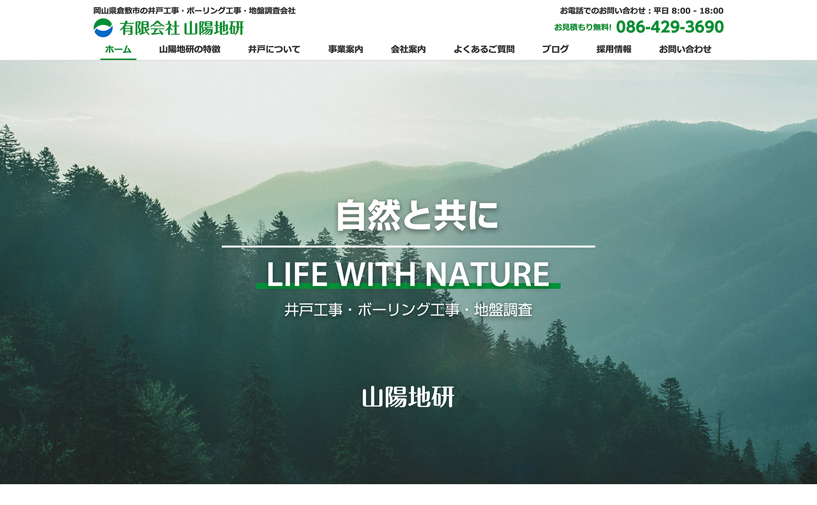
- Sanyo Chiken Inc.
- Year
- 2018
A logo design representing the business scope of a well drilling company based in Kurashiki City, Okayama.
We continued our collaboration with Sanyo Chiken Inc., a well-established company based in Kurashiki, Okayama, specializing in well drilling, boring work, and ground surveys, by designing their logo (symbol and type) following the creation of their website. Our comprehensive branding work included creating the website, brand messaging, taglines, logo mark, and type. The logo mark features green, representing the lush earth, trees, and mountains, while blue symbolizes water, including water sources, groundwater, rivers, ponds, and the sea. By combining these colors, the logo encapsulates the essence of nature and the planet, reflecting Sanyo Chiken's domain expertise in well drilling, boring work, and ground surveys. The typeface was meticulously chosen from a selection of carefully curated fonts. We created multiple versions of both Japanese and English typography, which can be used independently or in combination with the logo mark.
Credits
- Art Direction Logo Design Branding
- Shozo Karato, AEDI Inc.